SlangSpeak
- Role
- Product Designer
- Timeline
- 2024–2025
- Platform
- iOS
- Team
- 2 designers · 2 devs · 1 PM
My role
I led the post-launch diagnosis of the MVP through metrics, funnel analysis, and user testing, connecting qualitative and quantitative data to surface opportunities to improve the product. I also drove the product's visual and strategic evolution, building high-fidelity prototypes and refining the interface based on evidence, within real technical and scope constraints.
Context
Slang Speak is a dictionary of informal Rio de Janeiro slang, built to strengthen the cultural connection and sense of belonging of foreigners, and Brazilians from other regions, living in the city.
Trade-offs
Short delivery cycle
With a deadline of roughly one month, we prioritized cost-benefit decisions and picked our battles.
Technical constraints
The existing codebase already had conflicts, which ruled out structural changes given the risk of bugs and surprises.
Redesign in parallel
The app improvements happened alongside a refresh of the brand identity and a rebuild of the UI Kit, which split the team's focus.
Diagnosis
Quantitative analysis
From the MVP launch, I ran a strategic event-mapping focused on the product's core features and the funnels I'd want to analyze later. Everything was tracked through PostHog.
Fewer than 4% of downloads converted into active users.
Out of roughly 500 downloads, fewer than 20 users came back weekly, pointing to low retention and no hooks to pull people back in.
6 out of every 10 slang entries added were deleted.
A big chunk of the content-creation effort was being lost, which hinted at friction in how information got entered and corrected.
Only 4.6% of users finished a mini-game.
The high drop-off suggested the experience broke expectations right at the start.
Fewer than 10% of upgrade visits led to a purchase.
On top of the weak monetization, the data showed 85% of users never even explored that part of the app.
Qualitative analysis
To dig underneath the numbers, I ran moderated, in-person tests, both to investigate the pains I'd already spotted and to gauge the overall feel of the app. This let me validate hypotheses, surface new friction points, and understand the motivations behind certain behaviors.
Every fluent tester said they'd want to edit the slang information.
There was a recurring urge to edit slang, both entries users created themselves and the ones already in the app.
Every Portuguese-fluent participant pointed to the contextual nature of the language as the main reason, stressing that the same expression can mean different things depending on how it's used.
“I use this slang a lot, just not really in this context…”
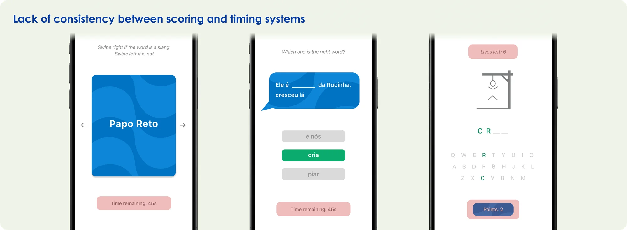
90% of testers showed some difficulty with the mini-games.
Most participants struggled to understand how they were doing, especially when playing the mini-games back to back.
The lack of progress feedback and the inconsistent scoring across games created confusion and unease, a sense of urgency even in activities with no time limit.
“Does this one have a timer too? I have no idea how I'm doing.”
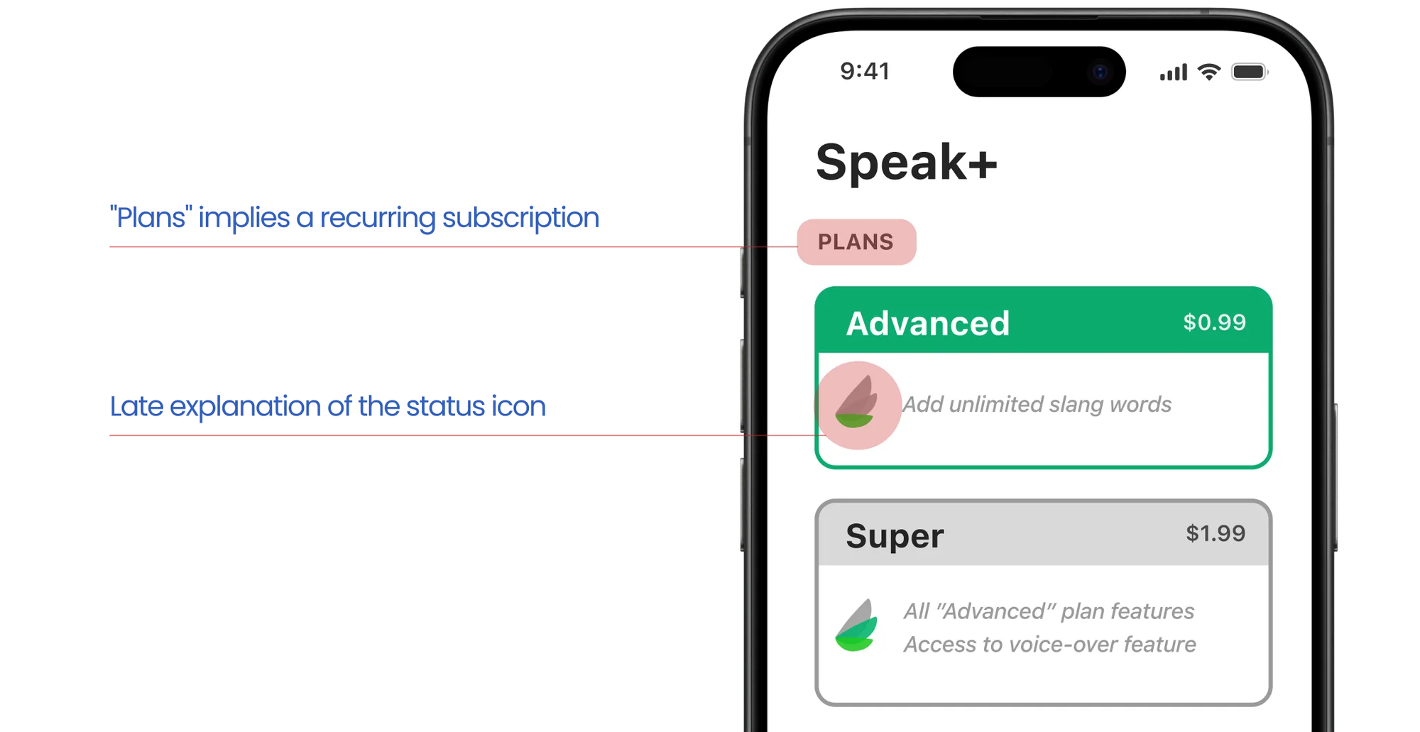
70% of testers struggled to find the purchase feature.
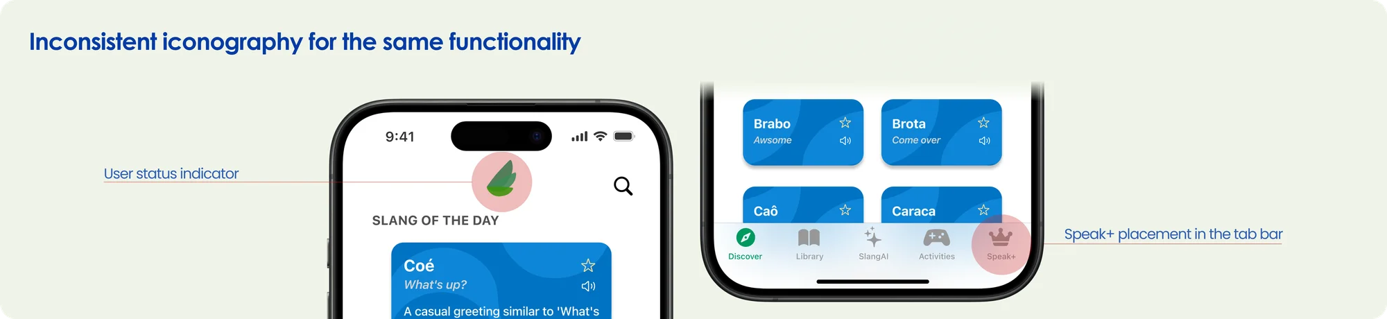
Most participants only found Speak+ after several tries, one of them being the wings symbol at the top center of the main screens.
On top of that, every participant read the upgrades as recurring subscription plans, a clear failure in how the payment model was communicated.
“Oh, now I get it! These little wings tell me which plan I'm on.”
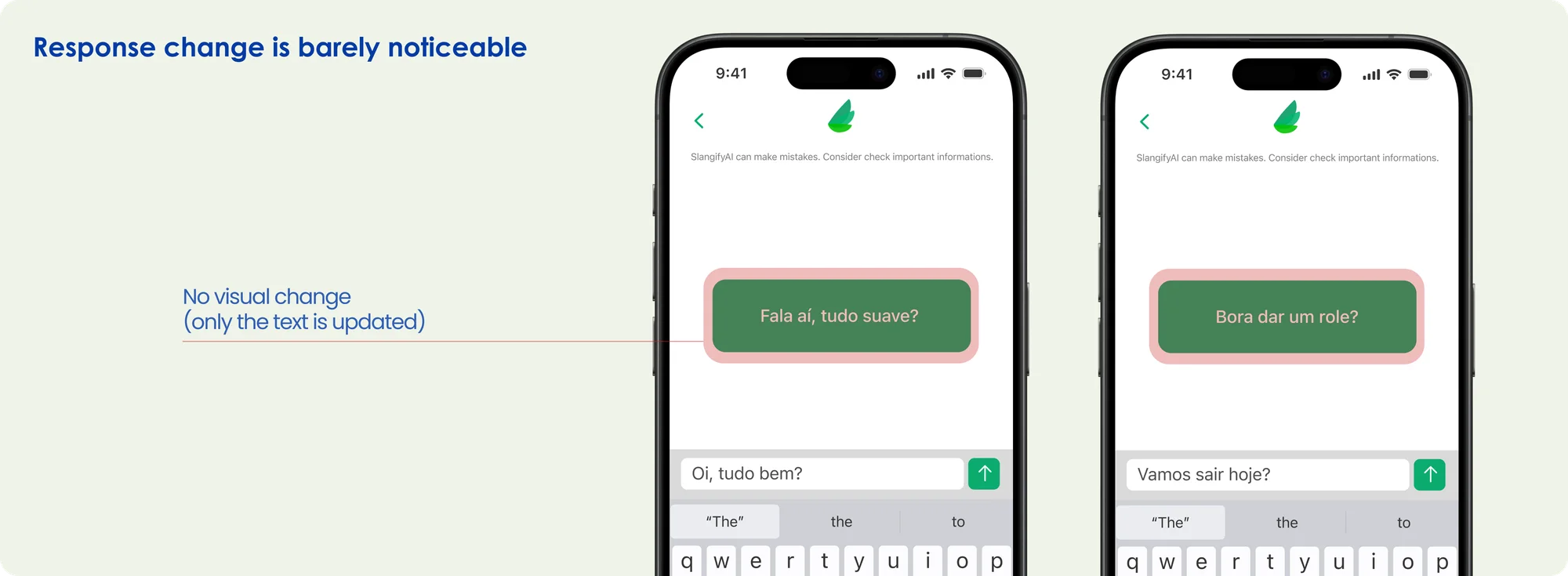
Half the testers didn't immediately notice when the AI's answer updated.
During testing, many participants didn't clearly register the AI response updating, especially across back-to-back interactions, because of the interface's weak visual feedback.
“Uh… did it freeze?”
Card sorting
Given the confusion around the upgrades area, I ran an open, individual card sorting with 6 participants. Users grouped the features intuitively, with no outside help. The groups they built were highly coherent and mostly named: Information, Learning, and System / Account / Settings (Speak+).
100% of participants isolated Speak+ into its own group.
Every participant created a dedicated group for Speak+, tying it to "System," "Account," or "Settings."
Since the app had no area for those items, the upgrade came across as a displaced feature with nothing else like it.
Problem synthesis
- 01
Low user retention
- 02
Frequent deletion of created slang
- 03
Mini-game abandonment
- 04
Low Speak+ conversion
- 05
Low perceptibility of AI response updates
Solutions implemented
Working from the data and the time and team limits, I proposed pragmatic, high-impact solutions that were doable within an implementation cycle of a month or less.
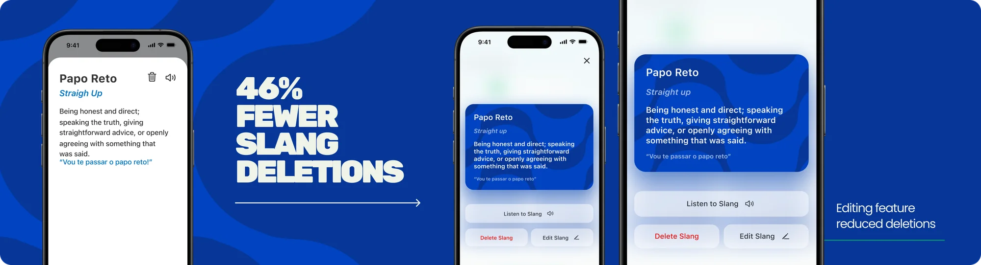
Frequent deletion of created slang
Evidence: 6 out of 10 slang entries added were deleted, and every fluent tester said they wanted to edit slang information.
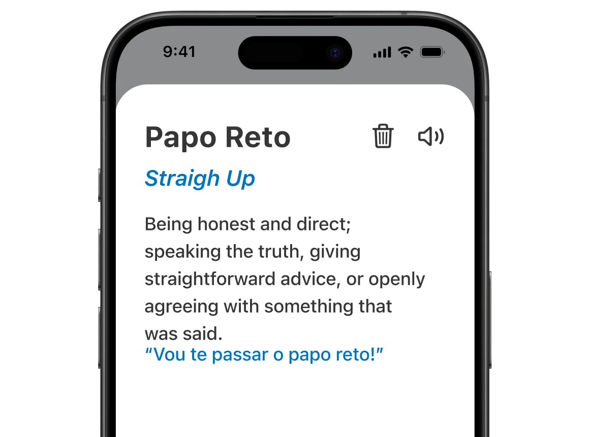
Solution: slang editing, multiple examples, and personal notes. I made it possible to edit user-created slang, giving people more flexibility to correct and adapt information without compromising the consistency of the app's official content.
Mini-game abandonment
Evidence: only 4.6% of users finished a mini-game, and 90% of testers reported trouble understanding them.
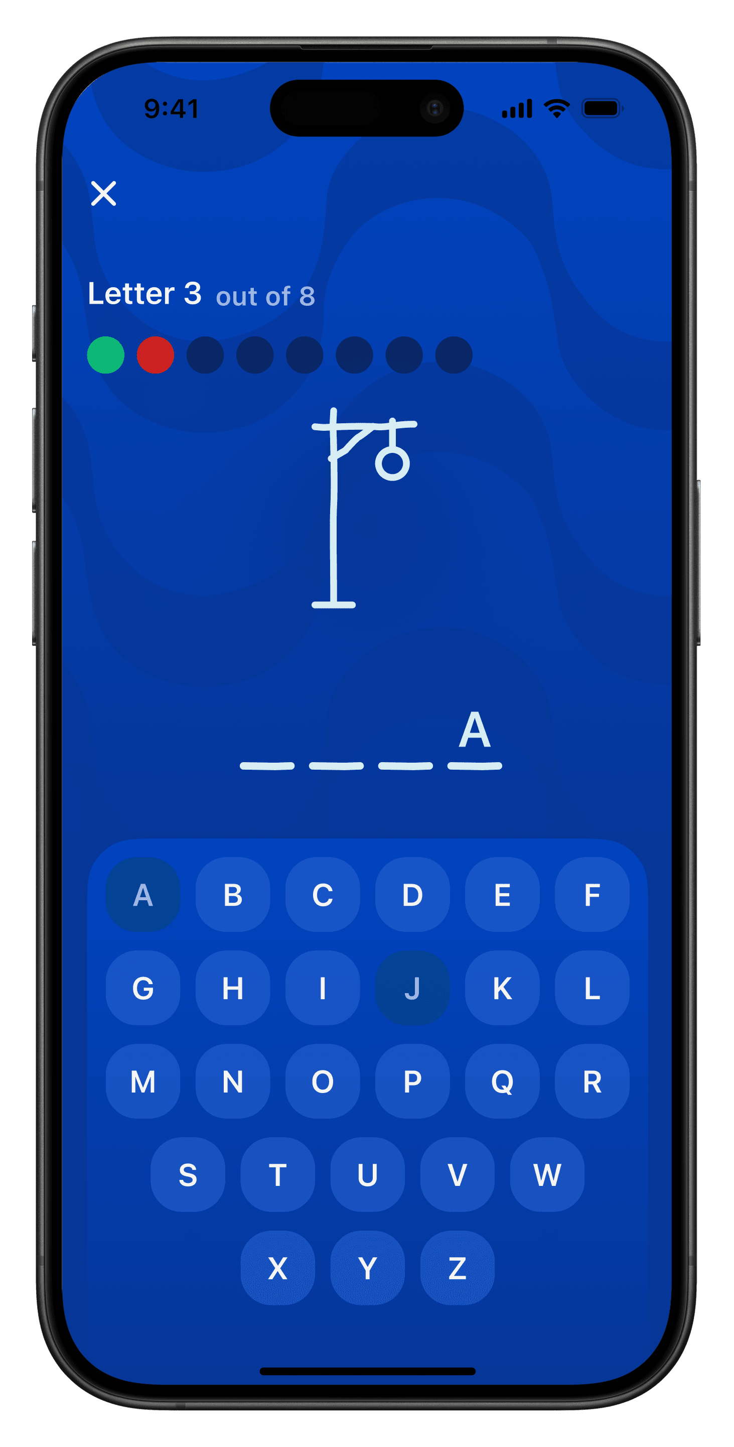
Solution: preview screens, standardized scoring, and visual feedback. The lack of clarity and feedback was causing confusion, pressure, and drop-off.
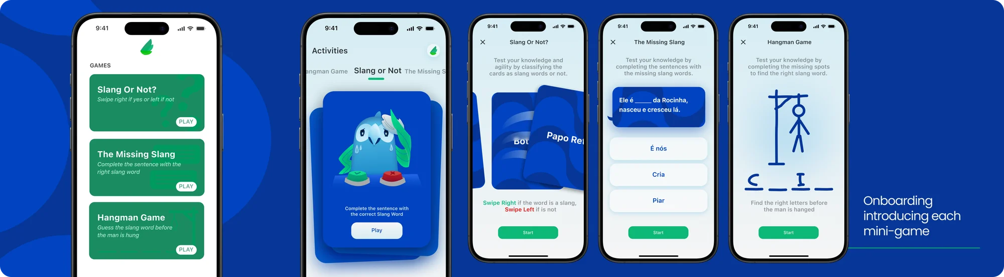
Preview screens went in to raise predictability and cut anxiety. I also built a single scoring system, with 8 visible chances and no time limit.
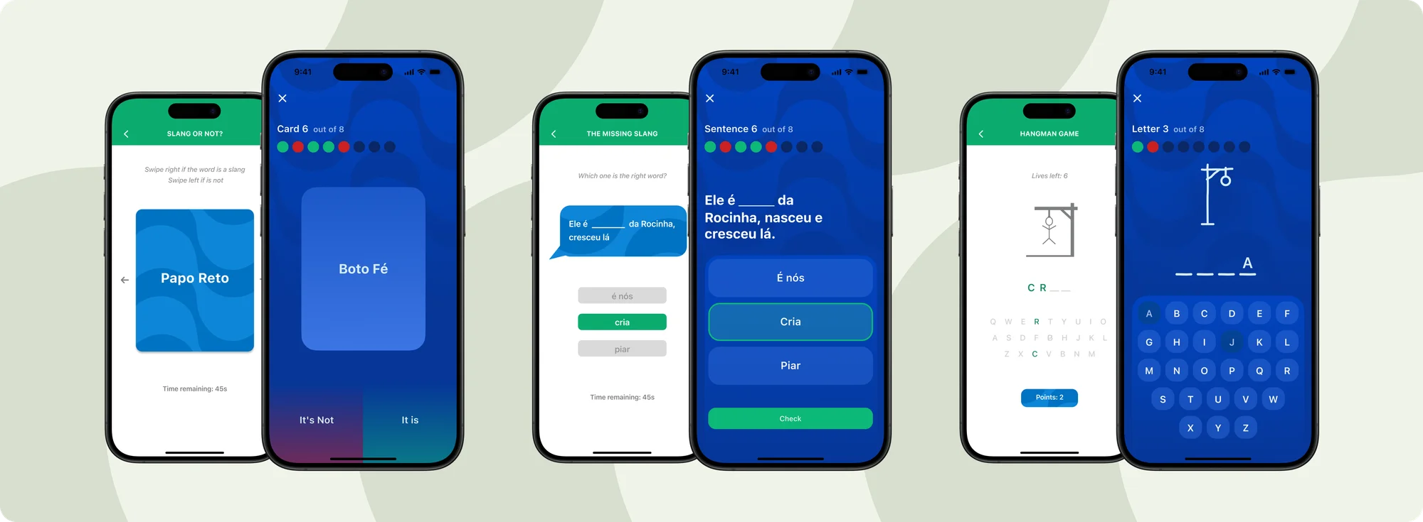
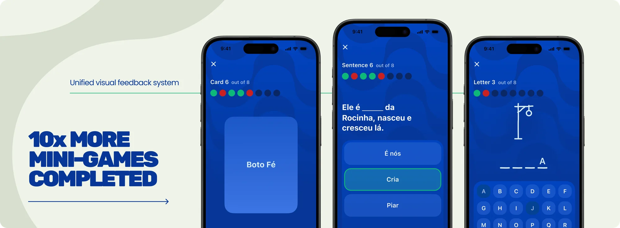
Even across different game dynamics, the visual feedback stayed standardized, creating consistency and familiarity.
Low Speak+ conversion
Evidence: 70% of testers struggled to find the purchase feature, and fewer than 10% of the users who did find it completed the purchase.
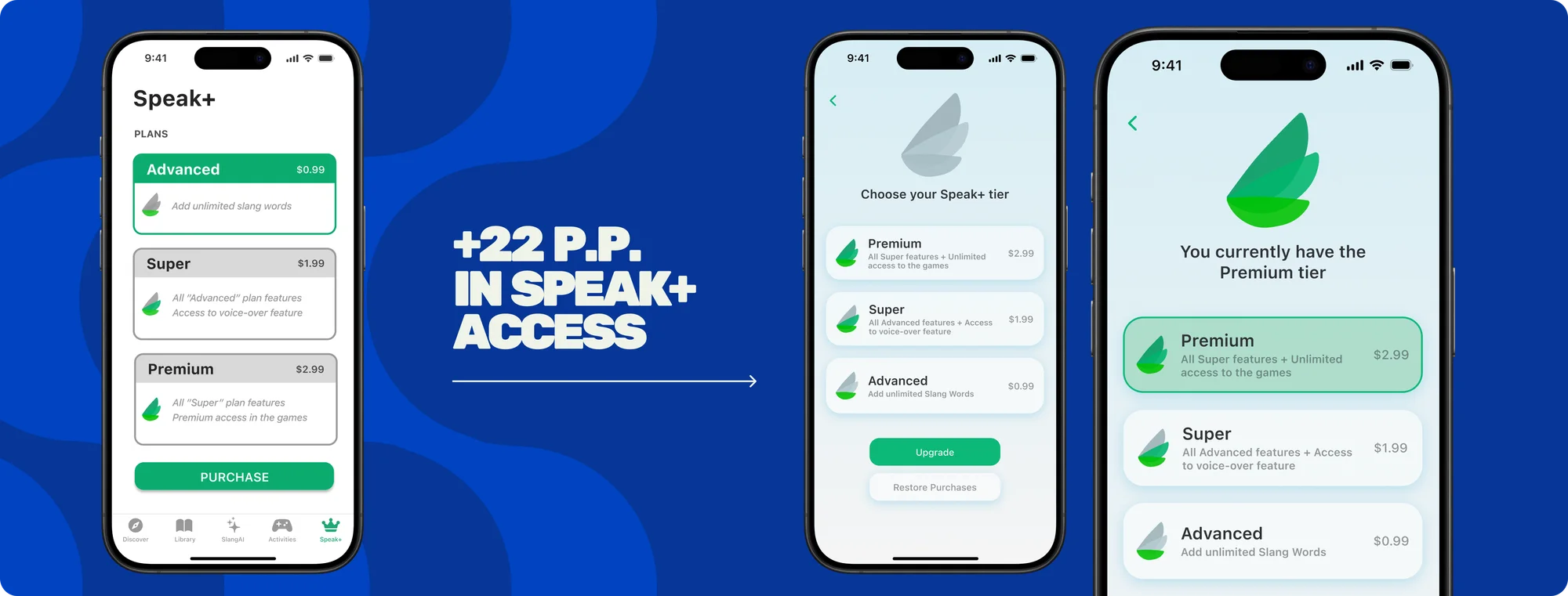
Solution: visual repositioning and a semantic fix. Testing showed Speak+'s low visibility was hurting conversion. The fix was to reposition the access point and merge the icon with the user's status, concentrating meaning and navigation into a single visual element.
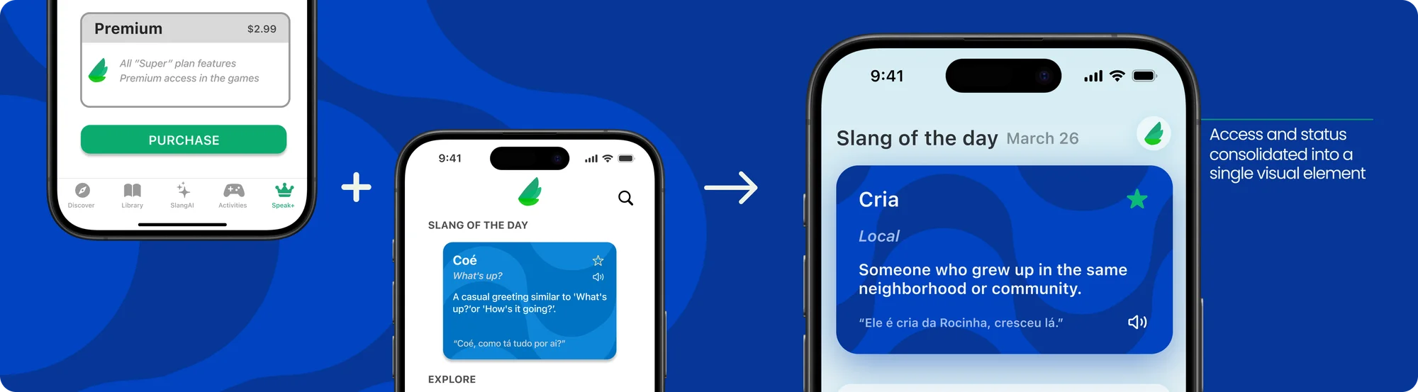
On top of that, the word "plans" was being read as recurring payment. I changed the wording to "tiers," reinforcing the one-time purchase model.
Low perceptibility of AI response updates
Evidence: half the testers didn't immediately notice when the AI's answer updated.
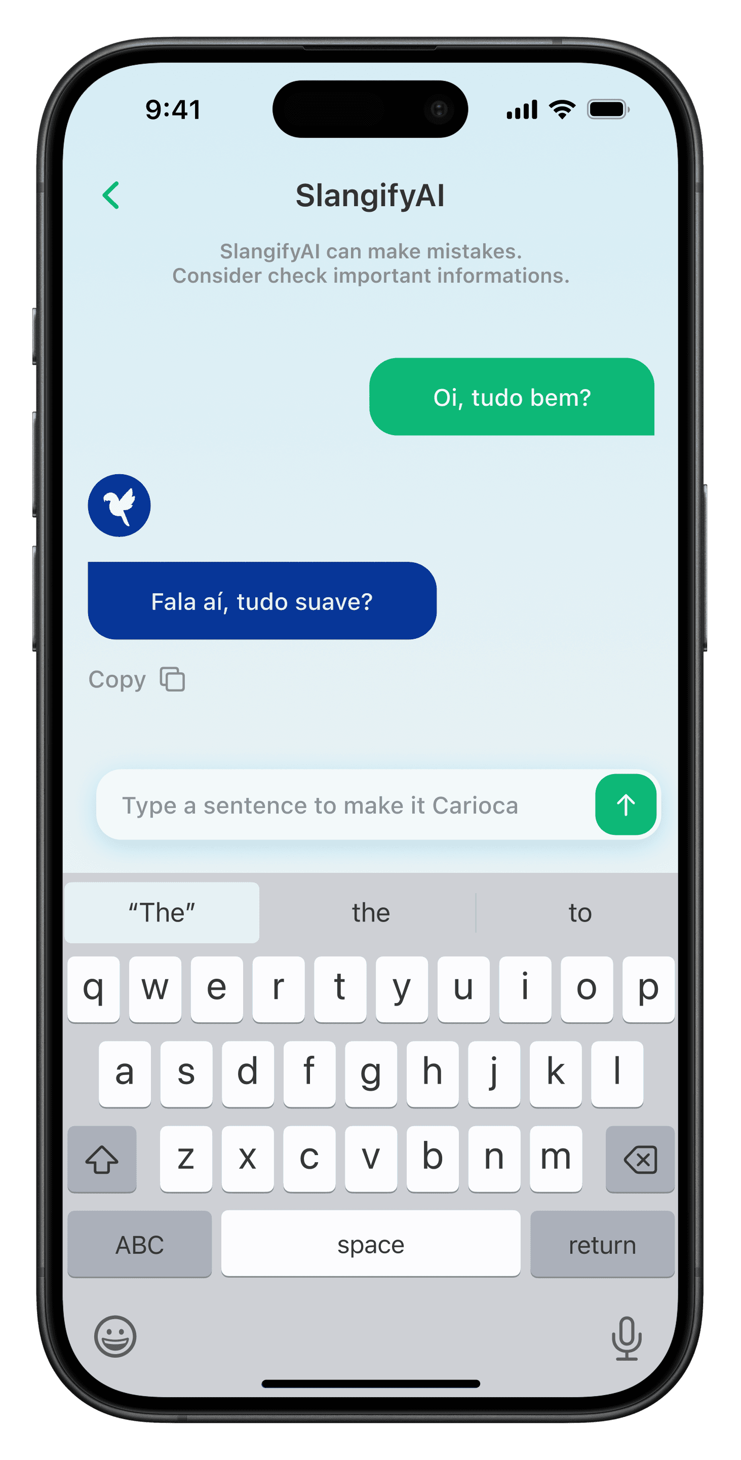
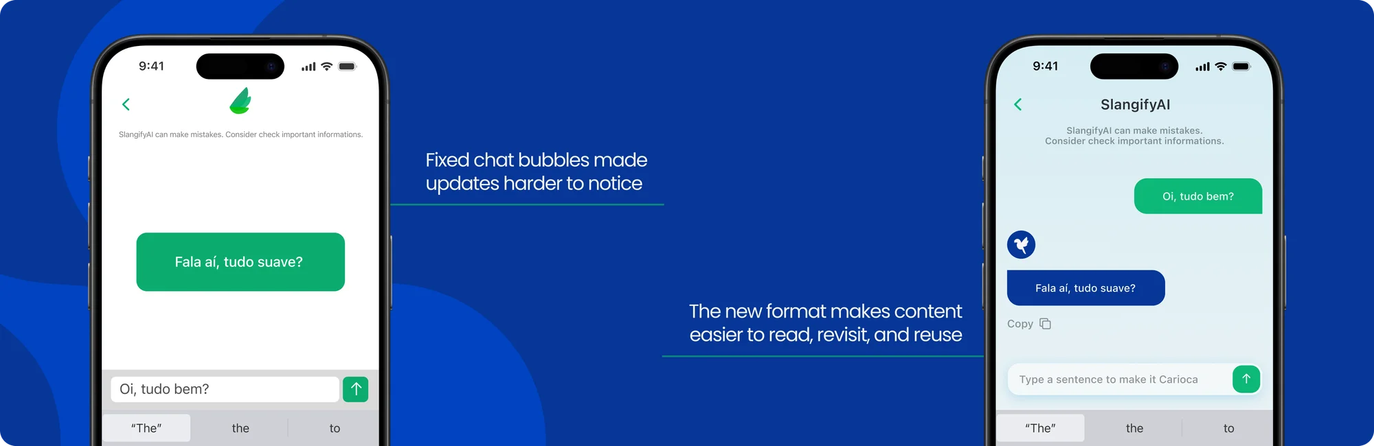
Solution: AI as a chatbot format. A fixed text bubble made it hard to notice when responses changed. Beyond keeping it familiar to other AI platforms, the chat format preserves interaction history, makes new responses easier to spot, and lets users copy the generated content.
About Retention
Evidence: fewer than 4% of downloads became active users.
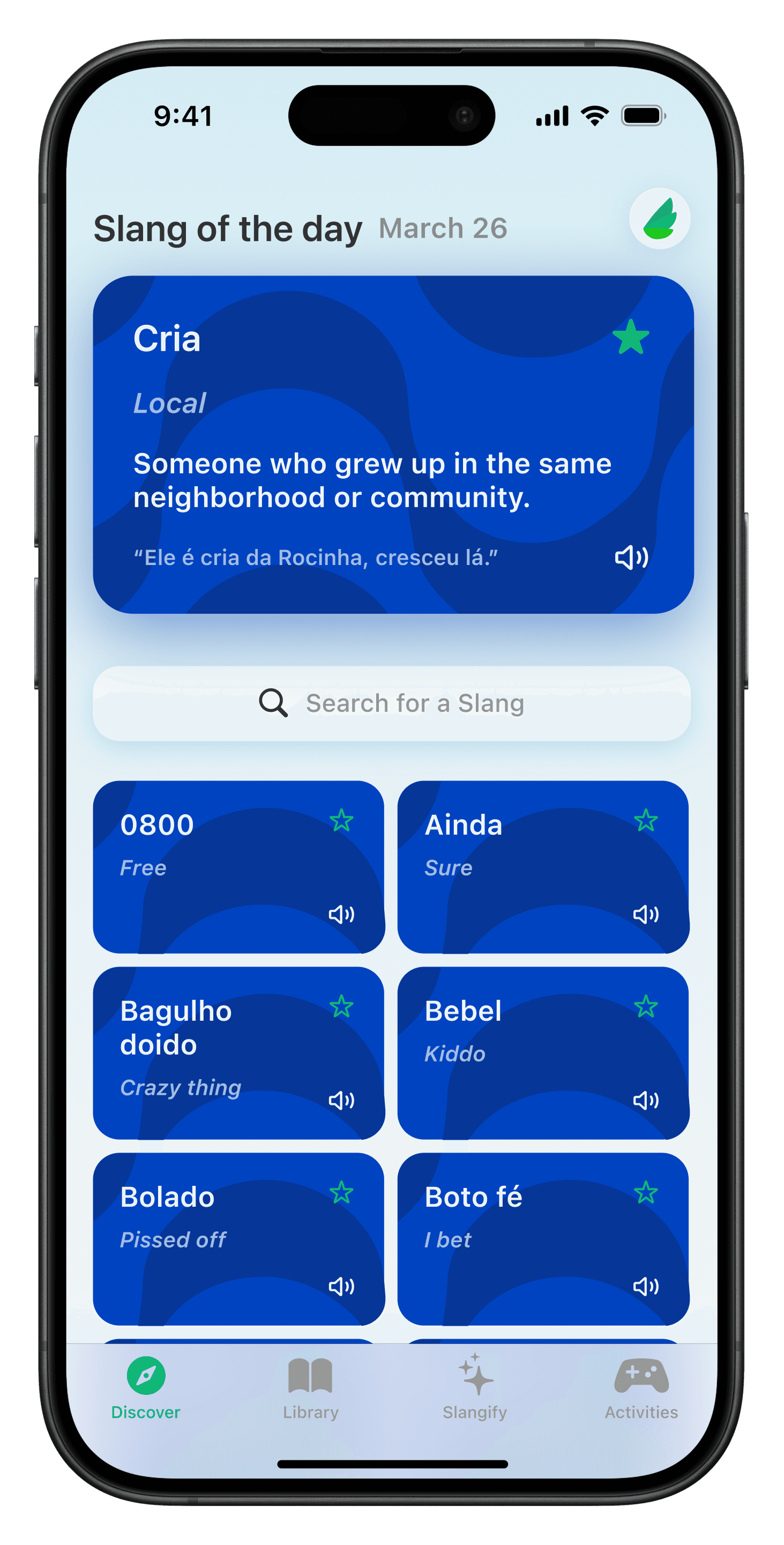
Solution: a widget and notifications as a daily external nudge. Retention turned out to be one of Slang Speak's most critical challenges, and coming back to the app depended entirely on the user's own initiative, a sensitive point for an informal learning product that nobody consumes daily out of obligation.
Desk research
To find viable paths, I ran research focused on education apps with high retention, with Duolingo as the main reference. The analysis pulled from UX-in-education studies, articles on engagement, and public data on gamification and personalization. I considered three main approaches:
Option A — Learning tracks and gamified progression
Building learning tracks with levels, XP, and visible progression over time. Why it works: gamification with clear progression can lift engagement by up to 48%, encouraging continuity and a sense of commitment to long-term goals (VEYRET, 2022). Benefit: creates purpose, clear goals, and an incentive to come back.
Option B — Progressive slang mastery
Showing mastery level for each slang as it appears in games and the user gets it right, marking terms as learned. Why it works: studies suggest personalization can raise content consumption by around 60%, keeping a sense of progression without excessive frustration (LI et al., 2022). Benefit: reinforces individual learning and creates continuous micro-rewards.
Option C — External reminders (the one I chose)
A widget and daily notifications with the "Slang of the Day," working as external, non-invasive, non-mandatory reminders. Why it works: notifications and external triggers raise the likelihood of returning to the app by cutting the cognitive effort of remembering it exists (MIKECRUNCH, 2023). Benefit: drives recurrence without touching the app's internal structure, reusing content that already existed.
Why the other options were dropped
- •
They required changes to the app's base structure.
- •
They needed more time and resources to build and validate.
- •
They required profile creation, data persistence, and new screens.
- •
They raised technical complexity in an app that runs entirely locally.
Given the limits on time, resources, and architecture, external reminders were the most viable and strategic option. The solution was designed to build habit without compromising the product's simplicity. The feature was implemented but never shipped to production, which meant I couldn't measure its impact.
Learnings and reflections
The context carried no financial risk or direct business impact, which opened room for decisions with less upfront validation, for better and for worse. That freedom allowed experimentation, but it also exposed moments where suggestions showed up more as "good ideas" than as decisions grounded in clear criteria.
Working on a lean team responsible for every stage of the product taught me that elaborate, over-ambitious solutions are rarely efficient when there aren't the resources to sustain them.
The retention pain, inspired by established benchmarks like Duolingo, was the hardest to address within a low-implementation-effort context.
Between us, the code was screaming for a refactor. But together with the P.M., we chose to leave it for another moment and prioritize solutions that respected the constraints.
“Good decisions respect the moment the product and the team are in, even when that means giving up prettier solutions in favor of more viable ones.”